The Washington Football Team is no longer. The Washington Commanders are officially here. It was indeed the worst-kept secret for the past month, as just about everyone knew the new name would be the Washington Commanders following the numerous leaks.
A new era is here. Surely, there are fans who hate the name change for a wide range of reasons. Ultimately, the name change is finally here after a 19-month wait.
There’s also a wide range of opinions on the process and how it was poorly executed. The leaks made the choice obvious. They were so obvious fans who didn’t like the Commander’s name held out hope the team was using misdirection. But that was not the case.
You’d hope it was by design. But, after watching team president Jason Wright and the Washington brass botch the Sean Taylor jersey retirement, you can safely assume that the leaks were more a botch than anything else.
With that said, there are some good things about Wednesday’s official presentation and of course clear mishaps. Let’s dive into them.
1. Can live with the Commanders
Look, it’s not the name many of us wanted. But it’s better than the Washington Football Team — my goodness I’m happy I don’t have to write that out much longer. Personally, RedWolves was the best choice. It’s obvious why they couldn’t pick that name — trademark issues.
Commanders are bland, for sure. But so are most other professional team names. If you’re a fan of the team, ultimately you’ll learn to live with it. Washington went through it with the name change from Bullets to Wizards. Wizards is the worst team name in all of pro sports, by the way.
The name is part of the overall presentation but Commanders itself is okay. What laminates a re-brand are the color scheme, uniform, helmet and logos. And that’s where this re-brand took a hit.
2. The crest should be the primary logo
The Washington Commanders have a great crest. It’s very similar to the crest that leaked during the unblurred video. Love it. Honestly, it’s the best part of the entire re-brand. So much so, it should be the primary logo. But of course it’s not.
The letterman jackets that owners Dan and Tanya Snyder wore along with current players and alum, fire. See the crest on the back? That’s near perfection. Would love to get my hands on one.
Love the crest so much so it should be the featured logo on the helmets. But it’s not.
3. Matte burgundy helmets, yes… Big W on helmet, meh
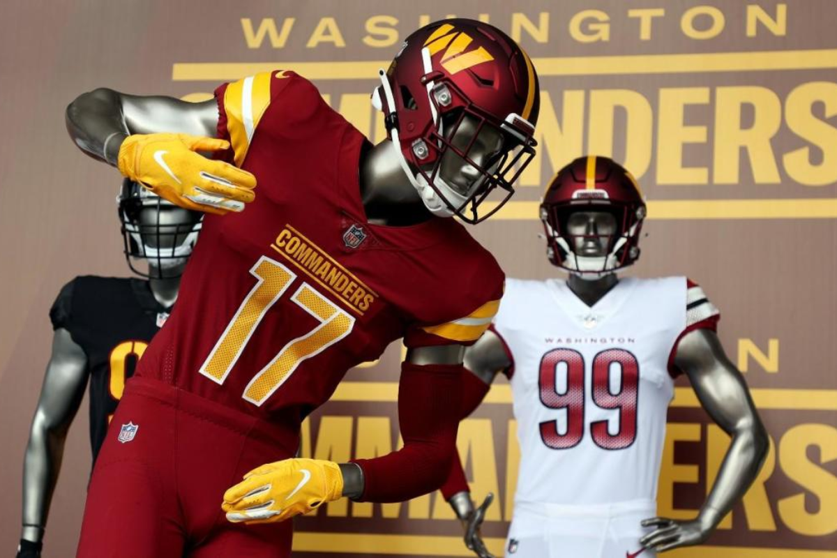
First thing to look at is the helmet. The team will use two helmets. First the traditional burgundy helmet. The biggest catch is the Commanders have moved to a matte helmet. The Minnesota Vikings were one of the first to try in a few years back. Now, Washington has one. Huge plus.
The regular helmet features a single gold stripe in the middle. The Football Team’s helmet did not have a stripe after decades in which the previous name used the yellow-white-yellow stripe combination.
The biggest flaw in the primary helmet is the “W” on the sides of the helmet. Don’t like the “W ” at all, especially on the helmet. They ripped the “W ” from the Washington Nationals of MLB, sort of like they ripped the Commanders’ name and it’s catchy new hashtag -from the San Antonio Commanders of the defunct Alliance of American Football.
4. Black helmets, numbers on side look cool, but the “W” on the front of the helmet?
The black helmet that will go with the alternate black uniforms has a large flaw at first sight. Instead of the huge “W” on the side of the helmet, the team put it on the front of the helmet. Who does that?
The side has the players’ jersey number in similar fashion as the Football Team had. No stripe in the middle, again like WTF. If the “W” logo was on the back or even the side, it would be great. That alone makes the helmet a miss.
5. The home burgundy uniform is clean
Along with the new name, Washington introduced three new uniforms. One burgundy, presumably the home uniforms. Another is all-white, presumably the primary road uniforms. The third is an all-black alternate.
First, the home burgundy uniforms starting with the jersey. The burgundy jerseys are the cleanest of the three. Traditional colors, not too much going on. They have the yellow-white-yellow stripes on the sleeves traditional to what their old helmets had.
The team’s crest on the back is also awesome. It’s a clean look.
Only issue is the “Commanders” script across the text. It’s too large. It also overshadows the rest of the uniform which is clean. The font choice for the numbers are also not ideal. Personally, prefer a traditional font.
The burgundy pants are cool too. Change the “Commanders” script and they’re blazing.
6. Throw the white uniforms in the trash
The Commanders have an all-white uniform. The pants are great, just solid white like the burgundy pants with no stripes. The jersey, throw it in the garbage.
First they look more like a rip-off of the Arizona Cardinals. Second, the gradient color for the numbers are bad. What’s worse about the uniform, it has red. Since when did Washington have red in their color scheme?
How do the Commanders have burgundy helmets with red in the jerseys? Red and black in the form of the Cardinals. “Washington” is the script on the chest plate. By the way, they should have used the same font and size on the home jerseys for “Commanders.”
The road white also looks like something made on custom designs on Madden. Nike was responsible for the design of the uniforms, so a lot of blame goes to them.
Remember when Nike destroyed the Buccaneers uniforms during the Jameis Winston era? Remember the ridiculous Jacksonville Jaguars’ two-tone helmets and uniforms? Or better yet the awful Browns redo. All three teams ultimately went back to their traditional look.
Washington could have done something more traditional with the Commanders’ name. Instead they allowed Nike to do their craziness. And it went way left on the white jerseys.
7. Black uniforms are tough but where the black come from?
Three uniforms and only one will have traditional colors, the home uniforms? When head coach Ron Rivera and Wright said the color scheme will stay, fans assumed for every uniform. Not just one.
How they have three uniforrms and neither syncs together?
The black alternate jersey has some good things about it. The DC city flag in burgundy and gold is great. The NFL shield on the chest, another good touch. The number font actually looks good on the black jerseys, much better than the burgundy. Even the “Commanders” script on the side of the chest plate, fantastic.
It’s just the color scheme in general. There wouldn’t be many qualms if Washington already had black as one of its primary colors. Two of the three uniforms have no link to the team’s tradition and history.
By the way, as the Commanders search for a jurisdiction to put its new home stadium in 2027, it’s hard to choose Virginia over Washington, DC with the DC city flag on the uniform.
8. #Takecommand is great just not original
As mentioned above, the concept of the Commanders isn’t unique. A pro football team already used the name. It also used the new NFL team’s hashtag #takecommand. As many hands were involved in the naming process, they couldn’t come up with a more original hashtag?
However, it’s a cool hashtag and tagline. Imagine fans inside FedEx Field or wherever down the line, chanting “Take Command?”
It has so much potential. So Washington Commanders fans, are you ready to #takecommand.
10. Overall reaction
Overall the uniforms and helmets are a dud. Everything about the reveal was a dud. The leaks made it the worst-kept secreat. The leaks being from inside the building makes it worse.
The reveal on NBC’s Today show was lackluster. The second reveal at FedEx Field for the media and fans, more lackluster.
The name had to change. RedWolves couldn’t be the new name. They picked Commanders. All are fine. The hashtag is great. But from the uniforms and helmets aspect they’re one of the worse in the NFL.
In fact, the primary burgundy helmet is the second-worst in the league only behind the Cleveland Browns. The uniforms are indeed the worst in the league now. The Commanders brass had 19 months and this is the best they could come up with? Seriously?


