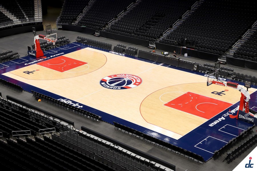
The Washington Wizards have a new court design for the upcoming 2019-20 season. The team unveiled the new design Wednesday on their social media platforms.
The most notable change is the half court logo. The team has swapped out the “dc” alternate logo and replaced it with the team’s official primary logo.
Fans who love the “dc” logo don’t fret, its now inside the shaded court on each end of the floor.
“The district” logo appears on the far side sideline. The Capital One Arena logo replaces the “Washington” logo on each ends baseline.
This may be the Wizards most clean look on their design in ages. The logos have more meaning. Of course no design is not perfect and there will be some criticism of removing the “dc” logo from midcourt, but the primary logo cleans up the floor.
Having the Capital One Arena logo moved to the baseline is a better position than they were in last season’s position. And by going baseline removes the eyesore clash of red letters of the “Washington” logo on a blue base.
The first on-court view will be their preseason opener Oct. 7 against the New York Knicks. Meanwhile, the Wizards’ regular season home opener is Oct. 30 against James Harden, Russell Westbrook and the Houston Rockets.


